On a Map Almost Every Classroom in America Uses, Africa and Greenland Look the Same Size. Africa Is Actually 14 Times Larger. The UN Just Voted 164-1 to Say the Map Is the Problem.
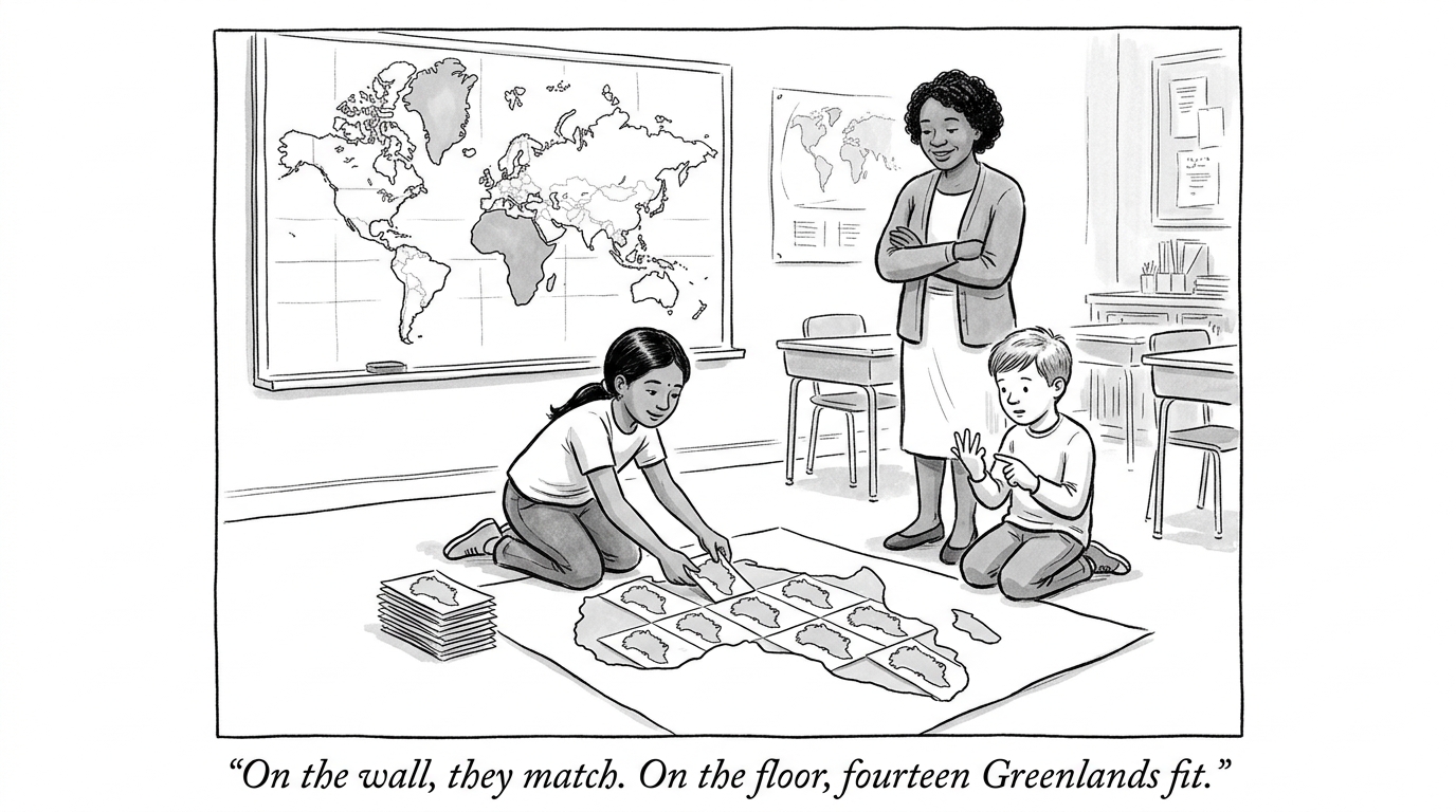
On September 4, 2026, the UN General Assembly voted 164-1 (the United States the lone "no," six countries abstaining) to encourage governments, schools, media, and technology companies to move away from the Mercator projection in favor of equal-area maps, especially the Equal Earth projection.[1] The resolution, sponsored by Togo and backed by the African Union, does not ban Mercator or mandate a replacement -- it is a non-binding recommendation, not a rule.[1] What it does is put an official UN vote count behind a fact that has been true, unaddressed, since 1569: on the Mercator projection, Greenland and Africa render as roughly the same size. Africa is actually about 14 times larger.[2]
Why the distortion exists, and why it is not symmetric
Mercator built his projection in 1569 to solve one specific, real problem: a straight line drawn on the map is a constant compass bearing at sea, which made it genuinely useful for navigation in the age of sail. The tradeoff -- unavoidable on any flat projection of a sphere -- is that area gets distorted, and it gets distorted worse the farther a landmass sits from the equator. That is not a politically neutral tradeoff in its effect: it systematically shrinks the equatorial and southern-hemisphere regions (Africa, South America, South Asia) and inflates the northern ones (Europe, North America, Russia) relative to their true size, which is why Mercator has stayed the default map in classrooms and software long after ships stopped needing it for navigation.[2]
The resolution is symbolic, and the sponsors said so themselves -- which does not make the underlying claim smaller. A map is usually treated as neutral, objective information -- it just shows where things are. But a map is also, quietly, an argument about relative importance: a version of the world where a continent looks smaller than it is trains generations of students, before they ever form a conscious opinion, to intuitively underweight what happens there. Togo and the African Union's own case for the resolution was explicit: a map that has shrunk Africa's visual footprint for 457 years plays some role in why Africa's economic and political weight gets underestimated by people who never separately checked the actual numbers.[1]
Why does this matter? This outlet has already argued that an incomplete telling of history -- one that erases entire regions' contributions -- teaches an entitlement bias that later prices real investment decisions, because a mind that never learned to expect capability from a place will not go looking for it there. A map that visually shrinks a continent by a factor of 14 is the same mechanism running through geography instead of history: a distortion nobody using the map today created, inherited without anyone deciding to keep it, doing quiet work on what a reader expects to find important before a single fact has been read.