Women Got 98% of the 162,000 Jobs the US Added in August. Almost Every Economist Who Looked Closely Says That Is Not Actually Good News.
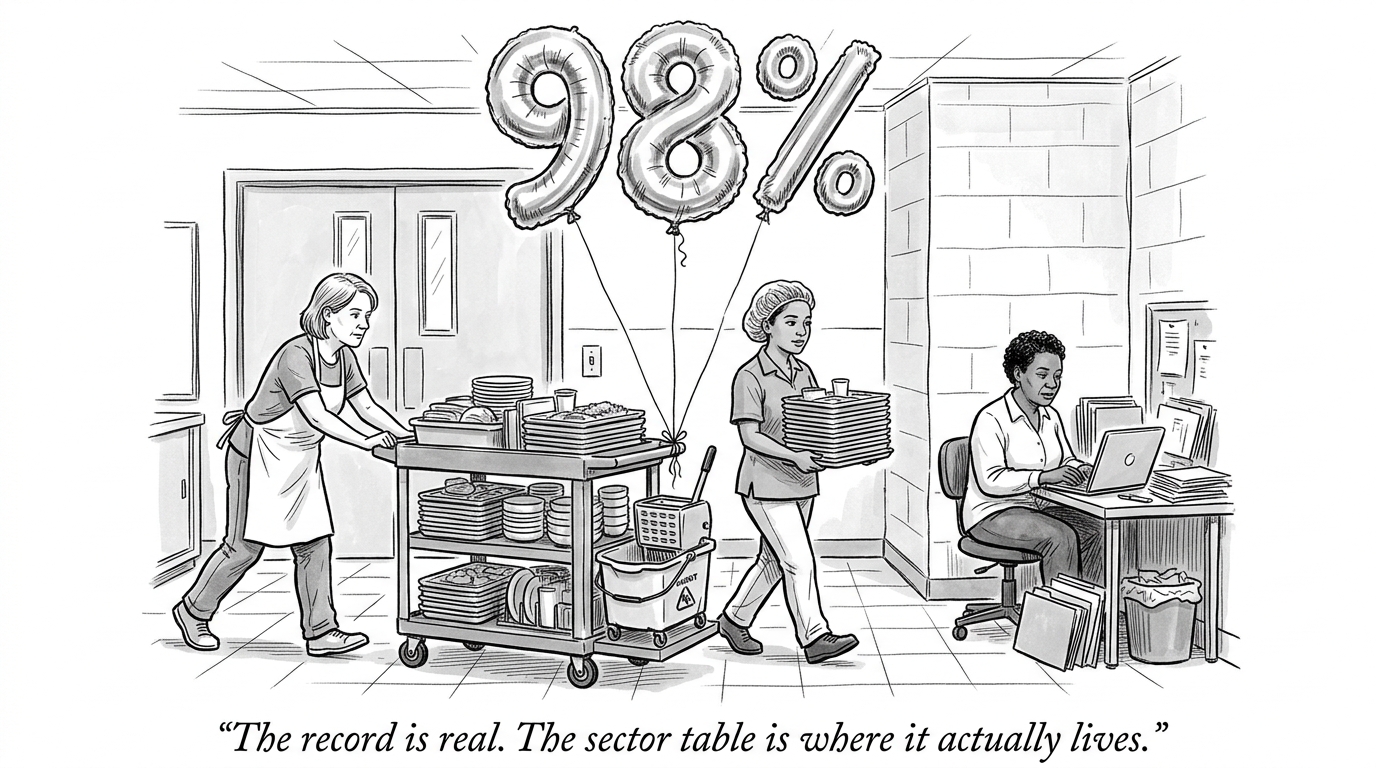
Women accounted for 98% of the 162,000 jobs the US economy added in August 2026, according to the Bureau of Labor Statistics -- an unprecedented figure, and one that pushed women past 50% of total nonfarm payroll employment (79.75 million jobs) for the first time.[1] Reported alone, that sounds like a milestone. Reported with the sector breakdown attached, it reads differently.
Where the jobs actually landed
Food services added 59,000 jobs. Local government education added 42,000. Healthcare added 13,000. Construction and manufacturing -- sectors that skew male and tend to pay more -- added 22,000 and 16,000 respectively, essentially flat against the female-dominated categories driving the headline number.[1] Indeed's Hiring Lab, reviewing the same data, offered the caution directly: because women are statistically more likely to earn less per job and more likely to hold multiple jobs to make up the difference, a hiring surge concentrated in food service, caregiving, and local-government education is not automatically "a positive story for women overall" even though it is, mechanically, a positive number.[2]
The honest complication: this is not a story about women being pushed into worse jobs by anyone's decision. It is a story about which sectors happened to be hiring that month, and which sectors happen to already be gender-skewed for reasons decades in the making -- caregiving and food service have been female-majority fields for a long time, independent of this one data point. The number is real. The interpretation problem is treating a sectoral hiring pattern as if it were, on its own, evidence of anything about how women are faring economically -- the same top-line figure could describe either genuine progress or a labor market quietly sorting new hiring into its lowest-paying lanes, and the topline number cannot tell those two stories apart by itself.
Why does this matter? A single percentage -- "98%" -- is built to travel on its own, stripped of the sector table underneath it, because it is the more shareable number. The sector table is where the actual economic content lives: which jobs, at what pay, in which industries, added under what conditions. This outlet has made a version of this same argument about a chip company's raw-compute promise and a data set that looked stronger from a distance than it did up close.[3] A record-setting topline figure is a real fact and, on its own, an incomplete one -- and the layer underneath it is very often where the honest read actually lives.
- US Bureau of Labor Statistics, Employment Situation Summary -- August 2026
- Fortune, Who Runs the Labor Market? Women Accounted for 98% of U.S. Job Gains in August
- DoAyni, Arm's CEO Says AI Will Cure Cancer Within Our Lifetime. IBM Already Spent $4 Billion Proving That the Compute Isn't the Part That's Missing.